Lead Generation
How to Make a High Converting Landing Page
How to Make a High Converting Landing Page
2016-02-26

Lead Generation
How to Make a High Converting Landing Page
2016-02-26

Lead Generation
How to Make a High Converting Landing Page
2016-02-26
Table of Contents
Auto Generated TOC
Auto Generated TOC
Auto Generated TOC
Auto Generated TOC
You’ve created a product or service that is seriously awesome, but people aren’t showing their interest. They aren’t emailing you or signing up, and this is getting kind of frustrating for you! This is a common scenario (you’re not alone!).
Luckily, there’s an easy to implement solution for you to overcome this problem you’re experiencing; you may to need to refine or redesign your landing page.
If you don’t feel like putting the effort into making clean landing pages, you’re likely missing out on a ton of leads. To put this into perspective: According to HubSpot’s 2012 Marketing Benchmarks Report, companies see an average of a 55% increase in the amount of leads they collect when they increase the amount of landing pages they have from 10 to 15.
This is because the layout of the page is a major factor in website success. And, with this in mind, it becomes clear why making landing pages is important. The more landing pages you are sending traffic to, the better picture you’ll see as to which page design performs best.
When you have a lot of landing pages and collect data around the performance of each page, you are able to stop making design guesses and start making informed design decisions.
To help you make some design decisions, before you’ve kicked off your landing page testing, we have put together a short guide on best practices for how to make a high converting landing page. These tips will help you create high converting landing pages more efficiently.
1. Be straight-forward
Being straight-forward means that you quickly and clearly explain what you do. This is important to do because people very rarely take the time to read through a complete page of information. However, what people will do is quickly scan the page to find something that catches their eyes.
To catch the eye of a website reader, you should have very clear headers and sub-headers. In addition, you should use brief bullet points that explain the value of your offering, and also use bold or italics to emphasize key items that the page reader should know.
2. Color choices are important
The colors that you decide to use on your webpages are very important. To start talking about this, we’re going to start off with the main call-to-action. Your primary call-to-action should be a vibrant color that stands out. This will help increase conversions because it makes it clear where visitors should engage with to complete a desired action.
We suggest that you consider using contrasting colors so that you don’t miss an opportunity to grab your visitor’s attention. Use the color that pops on the items where you want the user to complete an action, and keep the more calm colors of the design aspects that may distract from your main goals.
3. Clearly display your logo
To help people constantly remember that they’re engaging with your company, you should have your logo placed clearly on every page (in a strategic location). This doesn’t mean placing your logo smack in the middle of the page. It means deciding on where to place your logo consistently so that trust in your brand grows as the user browses your webpages.
4. Avoid information overload
Fancy looking images may sound good in theory, but too many visual typically destroys conversion rates. This is because elaborate visuals distract from the main goal, while also doing things such as making your website load slower. The negative impact of having a slower loading website is surprisingly large. Research by the Aberdeen Group showed that when a webpage loads one-second slower than normal, pageviews drop by 11%, customer satisfaction decreases by 16%, and conversions drop by 7% on average. If you keep your page simple, your conversion rate will be higher than if you fill it with tons of text and images.
5. Include social proof
Including social proof is one of our favorite tips for increasing landing page conversion rates. We like this because, while it works, it also gives you an opportunity to look at nice things that people are saying about your product or service (and this builds your own confidence in what you’re working on!).
Anyways, you should include social proof on your landing pages because it adds third party credibility to your offerings. Social proof means adding testimonials, case studies, or similar to your landing pages. Basically, anything you can do to shows how other people enjoy your product makes you a more trustworthy company.
Spend time searching through Twitter, Facebook, or other social networks and you’re bound to find some nice comments towards your company. We also recommend that you ask the person for permission to use what they’ve said about you. Asking for permission isn’t just a good thing to do since not everybody will want to be on your site, but it will also make the customer feel very appreciated and warmly acknowledged. The person giving the testimonial you’re posting is likely to become a “super user” and refer friends, family, and professional connections to your product or service.
Now what?
These 5 tips on how to make a high converting landing page are all simple to implement when designing or updating your pages. We are confident that if you try all, or even just one, of these tips, you’ll gather more leads and increase the amount of sales you close. Your business will grow.
BONUS TIP: Collect leads with no forms or buttons
A big part of lead collection is convincing people to fill out forms or press specific buttons. There’s a pretty awesome way that you can avoid having to make website viewers fill out a form or press a button; you can use a lead pixel. A lead pixel is a pretty magical tool that tells you which people or companies are frequently visiting your website. You can use this data to make smart decisions on which people or companies you should contact to try to sell your product or service to. To learn more about lead pixels, click here.

Generate More Qualified Leads with LeadBoxer
Create a (free) account or get a demo and find out how we can help you.

Generate More Qualified Leads with LeadBoxer
Create a (free) account or get a demo and find out how we can help you.

Generate More Qualified Leads with LeadBoxer
Create a (free) account or get a demo and find out how we can help you.

Generate More Qualified Leads with LeadBoxer
Create a (free) account or get a demo and find out how we can help you.
Get Started with LeadBoxer
LeadBoxer can help you quickly generate more leads
Get more insight into your online audience and their behaviour, and turn this data into actual opportunities.
Start Now!
Get Started with LeadBoxer
LeadBoxer can help you quickly generate more leads
Get more insight into your online audience and their behaviour, and turn this data into actual opportunities.
Start Now!
Get Started with LeadBoxer
LeadBoxer can help you quickly generate more leads
Get more insight into your online audience and their behaviour, and turn this data into actual opportunities.
Start Now!
Get Started with LeadBoxer
LeadBoxer can help you quickly generate more leads
Get more insight into your online audience and their behaviour, and turn this data into actual opportunities.
Start Now!
Other content in category
Lead Generation


Improved Lead Targeting Through Data-Driven Segmentation


Digital Lead Investing: Definition, Myths, Steps, and Strategies


5 Steps To Start Local Lead Generation For Your Business


How Do You Develop an Effective Content Distribution Strategy


What is Lead Enrichment?

Supercharge your marketing results with LeadBoxer!
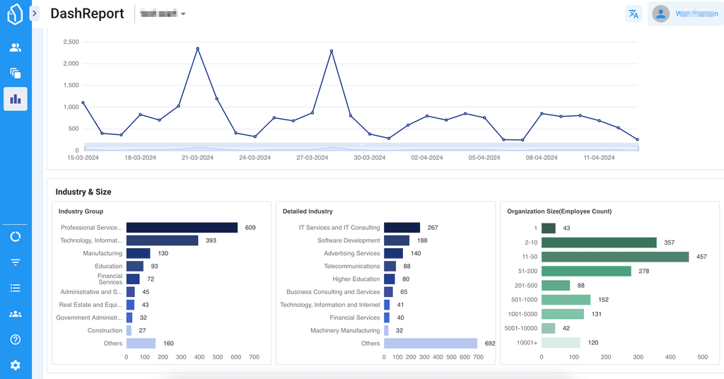
Analyze campaigns and traffic, segement by industry, drilldown on company size and filter by location. See your Top pages, top accounts, and many other metrics.


Supercharge your marketing results with LeadBoxer!
Analyze campaigns and traffic, segement by industry, drilldown on company size and filter by location. See your Top pages, top accounts, and many other metrics.


Supercharge your marketing results with LeadBoxer!
Analyze campaigns and traffic, segement by industry, drilldown on company size and filter by location. See your Top pages, top accounts, and many other metrics.


Supercharge your marketing results with LeadBoxer!
Analyze campaigns and traffic, segement by industry, drilldown on company size and filter by location. See your Top pages, top accounts, and many other metrics.
